May 7, 2015
In June 2014 the New York Times’ “Upshot” published a striking map depicting the hardest places to live in America.
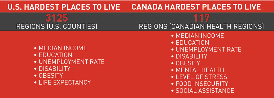
The map ranked 3,125 counties where “Americans are healthy, wealthy or struggling” based on six indicators: median income, life expectancy, obesity, disability, unemployment and college education.
While some may quibble about which measures should have been used, the Times was clear that they had chosen metrics based on their simplicity and the availability of quality data at the county level.
What would a map of the hardest places to live in Canada look like?
We know that there is considerable inequality and areas of concentrated poverty across Canada. In replicating the Times‘ map for Canada, we wanted to further explore the geographic dimensions of inequality and well-being in the country by comparing Canada’s 293 Census Divisions across nine social and economic indicators.
Unfortunately, we ran into some major data roadblocks
The most striking distinction between our map and the Times‘ is the level of geographic detail. While the original U.S. map compared 3,125 counties, our version of the map compares just 117 Canadian Health Regions. This was the most detail we could achieve without losing many of the indicators we chose. Only 95 of the Health Regions had sufficiently reliable data across all nine of our indicators to be included in the analysis. This means that large swaths of Manitoba and Saskatchewan have been left blank in our map.
Differences in how Canada and the U.S. collect and disseminate public data largely explain the discrepancy in geographic granularity. The U.S. census captures data related to both health and wealth, which, thanks to the census’ large number of respondents, allows for greater reliability at smaller geographic units when looking at how Americans are faring.
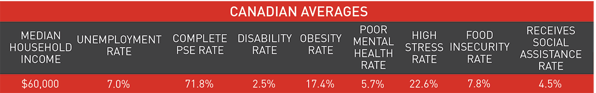
In contrast, a similar analysis of where Canadians fare better or worse would either combine rich census data on wealth — median income, education and unemployment — with much sparser health data gathered through the Canadian Community Health Survey (CCHS), which is limited by its considerably smaller sample size. Or, the analysis could solely rely on CCHS data, which covers both economic and social indicators. Ultimately, for greater data consistency, we chose the latter approach.
To conduct our analysis even at this level of geography (and not at the Census Division level, as we had originally hoped) we needed to combine four years’ worth of CCHS data, 2010 to 2013, to achieve a sufficient sample size. Though methodologically defensible, the results offer a less accurate and geographically detailed picture than they could have were health data collected through the census. Instead, we have to force comparisons of Canadian territories, large cities and clusters of smaller communities. This makes little sense.
The U.S. census captures data related to both health and wealth, which, thanks to the census’ large number of respondents, allows for greater reliability at smaller geographic units when looking at how Americans are faring.
Further, when attempting to make comparisons on a national level, the lack of data granularity masks diversity within large geographic units, both in urban centres like Toronto, Montreal and Vancouver, and in large rural and remote areas. Some neighbourhood-level data can be extracted from the same sources, but it is incapable of supporting comparisons at smaller geographic levels across Canada. Place-based approaches to address poverty and other social issues are impossible if we are incapable of place-based diagnoses.
This is to say nothing of the challenge of actually retrieving the statistical data in a usable format to build our database and the information necessary to map the results.
What our map does tell us
While the data isn’t as granular as we would like, the data that we do have draw a striking picture of the considerable differences in the quality of life across the country.
Our standardized, composite ranking of the Hardest Places to Live groups nine socio-economic indicators: five used in the original “Upshot” map and four others that shed more light on the challenges different regions face. We excluded other indicators we thought would be valuable (e.g., life expectancy, crime, consumer price index) because the data were not available even at the Health Region level.
We used these indicators to produce a map that categorizes different regions into groups by how well they are doing. Regions appearing lighter on the map are doing better according to this analysis than regions that appear darker. Looking at the map it is clear that there are pockets of struggling communities concentrated in particular areas, such as Atlantic Canada, Northern Ontario and Northern B.C. Other struggling areas are spread throughout the country.
On the other end of the spectrum, there are a number of regions that are doing relatively well. A number of these are capital cities and the areas around them. Some are communities connected to major resource extraction sites, while others are major urban centres or their suburbs.
Concluding thoughts
When we set out to create a map of the Hardest Places to Live in Canada, we wanted to create an interactive, evidence-based tool to encourage discussion about inequality. Given the challenges we encountered along the way, we shifted our focus to how the data needed to support that conversation is lacking.
Quite simply, it is very difficult in Canada to make useful, community-level comparisons across the country using survey data.
While Canada’s relatively small population and vast landmass pose clear barriers to performing this type of analysis in the first place, the data Canadian governments have chosen to collect and the instruments they use to capture it also pose huge challenges.
The census is our best, most reliable instrument for understanding what’s going on in communities across Canada. But even using the census to obtain local, reliable data has been made increasingly difficult following the replacement of the mandatory long-form census with the National Household Survey (NHS) in 2010.
The voluntary nature of the NHS has decreased the response rate from 93.5 per cent to 68.6 per cent, with the biggest drops occurring in smaller communities and rural areas. The result is poorer quality data and higher ‘suppression’ — the exclusion of data due to higher non-response rates. Non-respondents are also more likely to be individuals who face greater disadvantage, for example Canada’s Aboriginal people, and those who would benefit the most from the public services that census data could support.
Quite simply, it is very difficult in Canada to make useful, community-level comparisons across the country using survey data.
In addition, neither the NHS nor the census adequately capture data on health, which we know to be closely tied to both social and economic well-being.
In order to meet the needs of Canadians regardless of where they live, to deliver more targeted services, and to make smarter use of our limited resources, we need better evidence of how communities in Canada are doing, on their own and relative to others. To this end, we make four recommendations:
- Re-instate the mandatory long-form census to increase geographic reach and reliability of data.
- Expand the census to capture more health and social indicators in order to deepen our understanding of Canadian communities and the challenges they face.
- Strengthen the sharing of data among federal departments (e.g., RCMP and Statistics Canada) to improve the quality of data in key areas (e.g., crime).
- Adopt tools to make data more easily accessible and usable (e.g., common data formats, online searchable databases and open application programming interfaces or APIs).
The Mowat Centre would like to thank Maytree for its generous financial support of this project.
Methodological Note: While the New York Times constructed their index by taking the average relative ranking of each county across the six indicators that they included in their analysis, we opted not to use the average ranking because of the large number of regions that have the same value for several indicators – this is in part due to the lack of granularity of the data – and because of the large number of outliers in the data. Instead, we calculated our rankings based on a three-step process. First, we standardized scores for each indicator using the number of median absolute deviations from the median. This measure is less sensitive to outliers than the typical approach to standardization, which is to take the number of standard deviations from the mean. Second, we averaged the standardized scores across each indicator. Finally, we ranked the health regions based on their average standardized scores. Regions with lowest average score are considered to be doing worse and regions with highest average score are considered to be doing better.
More related to this topic
Authors
Nevena Dragicevic
Mark D. Jarvis
Rob Dorling
Kyle Hanniman,
Emma Tarswell
Release Date
May 7, 2015


